Project Description
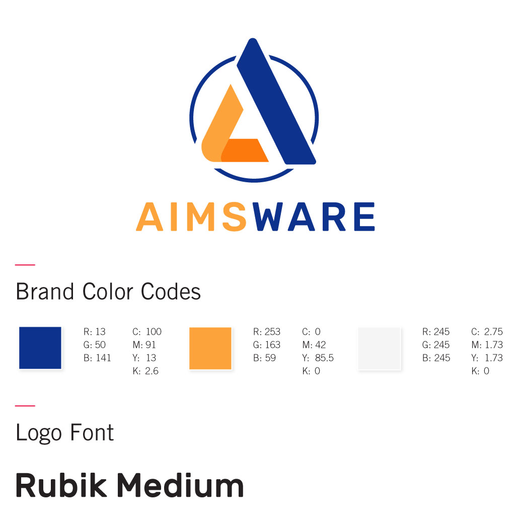
This logo used the letter “A” as inspiration. The abstraction of the letter “A” is to help create a logo that could stand on its own and that would work with or without the name of the company under it. The abstract “A” is enclosed in a three part circle. Like the other logo the three sections represent, one, how the software works, two the use of electronic invoices from vendors, and three the internal approval of clients and electronic payments. The color scheme was also updated to more vibrant colors that are currently related to the tech/software world.

Project Details
CLIENT
AIMSware
CATEGORY
Branding


